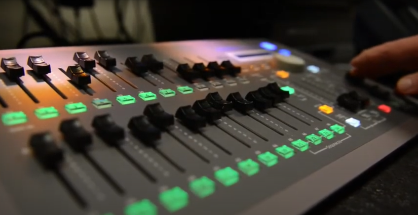
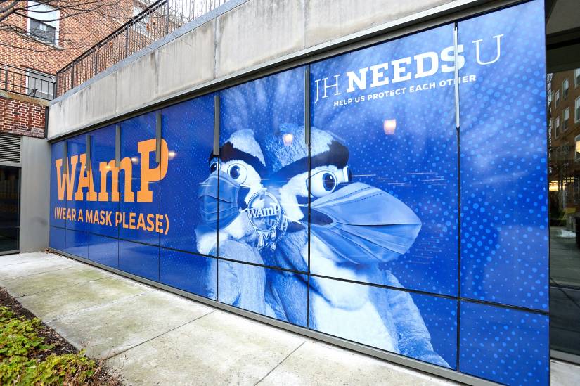
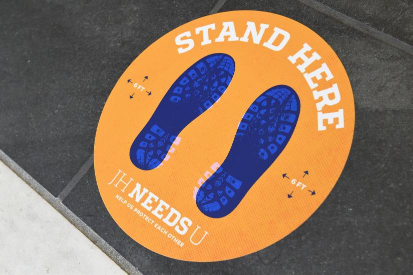
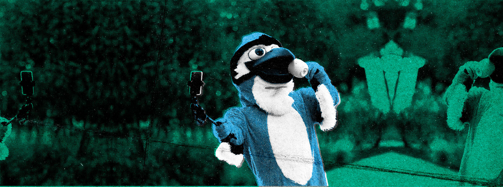
Covid communications
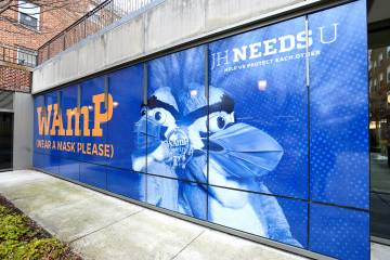
JHNeedsU
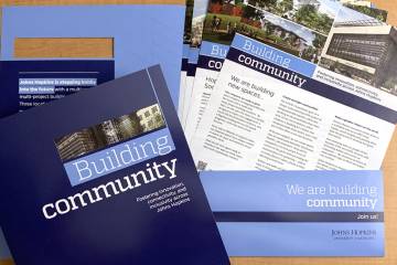
Through signage, messaging, a call center, and more, the university’s “JHNeedsU” campaign promoted safe and responsible behaviors among Johns Hopkins affiliates in the wake of the COVID-19 pandemic.
Johns Hopkins UniversityEst. 1876
America’s First Research University
This page uses the “Default” page template, which is what we typically use for inner pages. This paragraph uses the “Large” font size option. Typically we use this larger font size treatment for a sort of introduction to the page but that is not exclusive.
The hero image above can either be set to the default for the site (which is hard-coded into the CSS for each theme), individually set, or inherited from the parent page. This page’s hero image has been inherited from its parent page (Web Strategy).
“Default” pages have the option to have a left nav, a right sidebar, or neither. Currently there is no way to include a left nav and a right sidebar on the same page (in progress). This page includes the left nav. This is a regular paragraph using the “Default” font size option.
ON THIS PAGE
Featured content blocks pull from pre-built teasers; a separate content type within the site. Featured content can be set to either a, “Primary” or “Secondary” treatment.
This collection of headline and paragraphs is in a group block with the content area set to 825px wide and the “wide” width set to 1071px wide.
This section is a cover block. Cover blocks on pages with a sidebar set to use the “Full Width” horizontal alignment will display at the wide content width setting of their containing element. They still allow a section to use the wide layout width with a background image or color while the content within maintains the set layout width. This paragraph uses the “Large” font size option.
This is a paragraph with a thumbnail image set to align left to demonstrate how text wraps around images. Images can be aligned left, right, center, wide, or full width and have three size options; thumbnail, medium, and large. Unless specifically set on the containing block the “content” and “wide” widths are the same at 1071px, in this specific example the content width has been set to 825 px which matches 8/12 columns of our column grid system at the largest screen size. This paragraph uses the “Default” size.
Lorem ipsum dolor sit amet, consectetur adipiscing elit. Vivamus vestibulum laoreet mi at volutpat. Donec tristique nunc tellus, in rutrum nisl euismod at. Aenean cursus, tortor sit amet laoreet dictum, mauris lacus rutrum elit, et maximus odio orci ut ligula. Maecenas non egestas neque. Integer non turpis nibh. Nunc posuere, nibh id tristique posuere, mi lorem congue ex, a maximus dui arcu et justo. Curabitur erat nulla, lobortis sit amet condimentum at, suscipit ac quam. Nulla dapibus risus suscipit tortor suscipit consequat. Cras id enim magna. Nunc ornare mi at vulputate hendrerit. Etiam nec porta tortor, sed feugiat sem. Fusce vel enim eu leo vehicula scelerisque.
Use our email signature generator.
The JHU Trademark Licensing Program is available in our brand guidelines.
You can fill out the studio request form.
IN THIS SECTION
Paragraphs are shown throughout this page. There are multiple options for paragraphs to allow for better typographic hierarchy, more flexible design options, and improved accessibility through size/color options. This section was set in a Group block with a content width of 825px and a wide width of 1071px to limit the overall line length of the copy on the page.
This paragraph is aligned left. Proin consectetur aliquet scelerisque. Aliquam at felis vestibulum, malesuada leo id, volutpat metus. Sed vestibulum fermentum nisi, vel aliquet metus rhoncus et. Quisque mattis dolor libero, nec tincidunt leo ultricies non. Phasellus rhoncus, lectus et rutrum convallis, eros augue aliquam erat, in venenatis urna elit quis ex. Vivamus eleifend sodales diam nec consectetur. Pellentesque nec ex gravida, ultricies magna vel, condimentum mi.
This paragraph is aligned center. Proin consectetur aliquet scelerisque. Aliquam at felis vestibulum, malesuada leo id, volutpat metus. Sed vestibulum fermentum nisi, vel aliquet metus rhoncus et. Quisque mattis dolor libero, nec tincidunt leo ultricies non. Phasellus rhoncus, lectus et rutrum convallis, eros augue aliquam erat, in venenatis urna elit quis ex. Vivamus eleifend sodales diam nec consectetur. Pellentesque nec ex gravida, ultricies magna vel, condimentum mi.
This paragraph is aligned right. Proin consectetur aliquet scelerisque. Aliquam at felis vestibulum, malesuada leo id, volutpat metus. Sed vestibulum fermentum nisi, vel aliquet metus rhoncus et. Quisque mattis dolor libero, nec tincidunt leo ultricies non. Phasellus rhoncus, lectus et rutrum convallis, eros augue aliquam erat, in venenatis urna elit quis ex. Vivamus eleifend sodales diam nec consectetur. Pellentesque nec ex gravida, ultricies magna vel, condimentum mi.
Paragraphs can have a text and background color set individually. These colors are set in the block options and are not readily customizable. Colors are named after their PMS values. This paragraph uses PMS 173 C as the Text color.
Paragraphs can also have a background colors set. In these situations it is key that you also modify the paragraphs padding in the Dimensions options to maintain proper visual space between the text and its container. This paragraph is set in PMS 7406 C on a background of PMS 288 C. Link colors may also be customized to account for the new text and background colors. As always accessible color combinations are vital and you should check that the combinations you are using meet WCAG 2.1 AA compliance.
Paragraphs support multiple sizes to improve typographic hierarchy within a page layout. These should be used when semantically a headline would be incorrect, e.g. a messaging tagline ahead of a CTA.
XXX-Large
The five boxing wizards jump quickly.
XX-Large
Pack my box with five dozen liquor jugs.
X-Large
Go, lazy fat vixen; be shrewd, jump quick.
Large
When zombies arrive, quickly fax Judge Pat.
Medium
Amazingly few discotheques provide jukeboxes.
Default
The quick onyx goblin jumps over the lazy dwarf.
Small
Brawny gods just flocked up to quiz and vex him.
X-Small
Watch “Jeopardy!”, Alex Trebek’s fun TV quiz game.
XX-Small
Six big devils from Japan quickly forgot how to waltz.
XXX-Small
Five or six big jet planes zoomed quickly by the tower.
Headings are semantic elements that provide structure to the content of a page as well as allow the user to quickly scan the page for the content that they’re looking for. It is important that headings are used in the correct order, especially for users using assistive technology so they can accurately understand the content structure of a page.
H1
H2
Note: H2 styles differ on homepage templates because H2s are used as our section/block headlines. They are centered by default and automatically include the dash below them. The example above has been modified to be aligned left.
H3
H4
H5
H6
Note: H6 is frequently used as a combination of section break and headline especially in tighter areas like narrow columns, within sidebars, and in footers.
Lists support either ordered or unordered treatment.
Quotes in WP technically support font size styles but there are no styles to support those font sizes. Do not alter the font size of the quote. Text color can be altered as needed depending on the background color of the section it’s within.
Lorem ipsum dolor sit amet, consectetur adipiscing elit. Fusce aliquet, nisl eu luctus mollis, felis urna vestibulum erat, ut dignissim dolor eros vel lectus. Proin varius tincidunt finibus. Quisque eget dui velit.
John Hopkins
Similarly styled to the quote block. In future revisions this treatment may be improved.
Nulla ac congue odio. Quisque congue fringilla dui quis interdum. Vivamus pharetra velit id elit consectetur fringilla. Mauris tincidunt nulla non dictum lacinia. Praesent in egestas velit, id ultricies enim.
John Shopkins
We also have a custom quote block that includes significant visual enhancements to the quote. This is found under the “JHU Blocks” section.
Pull quotes are heavily stylized when using the “Homepage” template. Ideally kept short and sweet, but are flexible enough to accommodate longer, more complicated messages.

Code blocks allow editors to present code in a pre-formatted display that makes it easier for developers to understand the content and copy/paste into their own projects as needed.
.has-text-color {

  * {
    color: inherit;
    text-decoration-color: inherit;

    &::marker {
      color: inherit !important;
    }
  }
}
Details blocks act as an accordion to present short-form information or questions with connected long-form explanatory or clarifying content. The summary area may only contain text while the hidden content may contain any other WP block:
Lorem ipsum dolor sit amet, consectetur adipiscing elit. Fusce aliquet, nisl eu luctus mollis, felis urna vestibulum erat, ut dignissim dolor eros vel lectus. Proin varius tincidunt finibus. Quisque eget dui velit. Praesent aliquam nunc vel molestie elementum. Duis vehicula et nunc a tempus.
Sed interdum, eros non eleifend pharetra, felis risus euismod arcu, sed bibendum lectus sem pretium turpis. Quisque a ex sed enim euismod varius nec sed justo. Vivamus turpis dolor, dictum sit amet tempor sed, mattis a mi.

Lorem ipsum dolor sit amet, consectetur adipiscing elit. Pellentesque velit leo, sodales eget dui et, pharetra scelerisque massa.
Tables organize structured, or more complicated data sets. It should be noted that they are inherently unresponsive and as such tables with more columns may display in less than ideal ways on smaller width screens or in narrower layouts. There are options for text and background color for the entire table and not individual cells.
| Common Name | Type | Genus | Species |
|---|---|---|---|
| Daylily | Perennial | Hemerocallis | Hybrids |
| French Marigold | Annual | Tagetes | Patula |
| Lilac | Shrub | Syringa | Vulgaris |
| Sugar Maple | Tree | Acer | Saccharin |
| These are footer labels | These are footer labels | These are footer labels | These are footer labels |
IN THIS SECTION
The media section is contained within a cover module with a horizontal alignment of, “Full width,” the “Inner blocks use content width” option turned on, “Content” width set to 825px wide, and “Wide” width set to 1071px.
Images can be manually set to expand on click but captions are not yet visible in this view. This is functionality that will be accounted for in the near future.
Images can be sized and positioned on the page using a combination of the horizontal alignment and resolution settings. The combination of these settings with correctly size the image for each layout, but those sizes can be overridden by manually setting the images aspect ratio, width, and height in the block options sidebar.
Setting the horizontal alignment to, “none” will display the image at its original size up to a maximum width of the content area, in this case that is set at 825px. This alignment setting does not allow text to wrap around the image.


Setting the horizontal alignment to, “Wide width” will display the image at its original size up to a maximum width of the wide content area of its container, in this case that is set at 1071px. This alignment setting is only accounted for if using the, “large” image resolution. This alignment does not allow text to wrap around the image.
Setting the horizontal alignment to, “Full width” on pages with a sidebar will display the image at the wide content width to keep image from breaking out of the content layout it is within and overlapping the sidebar content. This alignment does not allow text to wrap around the image.
Setting the horizontal alignment to, “Left” will display the image at pre-determined sizes based on the images selected resolution. Image aspect ratio, width, and height can be overridden using the block settings in the right sidebar. If the container’s content width is less than 1071px wide the images will extend past the left edge of the content area. This alignment does allow for text to wrap around the image and is its intended use-case.
Lorem ipsum dolor sit amet, consectetur adipiscing elit. Fusce aliquet, nisl eu luctus mollis, felis urna vestibulum erat, ut dignissim dolor eros vel lectus. Proin varius tincidunt finibus. Quisque eget dui velit. Praesent aliquam nunc vel molestie elementum. Duis vehicula et nunc a tempus. Nam condimentum dignissim eros, non convallis justo congue eget. Sed interdum, eros non eleifend pharetra, felis risus euismod arcu, sed bibendum lectus sem pretium turpis. Quisque a ex sed enim euismod varius nec sed justo. Vivamus turpis dolor, dictum sit amet tempor sed, mattis a mi. Nulla bibendum nibh quis felis suscipit, ac efficitur felis scelerisque. Lorem ipsum dolor sit amet, consectetur adipiscing elit. Pellentesque velit leo, sodales eget dui et, pharetra scelerisque massa. Vivamus cursus nulla non maximus egestas. Ut ut suscipit turpis, at luctus nunc. Ut ut nulla vitae mi pulvinar iaculis ut sed turpis.
Proin consectetur aliquet scelerisque. Aliquam at felis vestibulum, malesuada leo id, volutpat metus. Sed vestibulum fermentum nisi, vel aliquet metus rhoncus et. Quisque mattis dolor libero, nec tincidunt leo ultricies non. Phasellus rhoncus, lectus et rutrum convallis, eros augue aliquam erat, in venenatis urna elit quis ex. Vivamus eleifend sodales diam nec consectetur. Pellentesque nec ex gravida, ultricies magna vel, condimentum mi.
Nulla ac congue odio. Quisque congue fringilla dui quis interdum. Vivamus pharetra velit id elit consectetur fringilla. Mauris tincidunt nulla non dictum lacinia. Praesent in egestas velit, id ultricies enim. Sed dictum, justo non ultricies faucibus, diam felis tristique justo, id vulputate ipsum ex nec diam. Sed libero orci, molestie quis nisi non, feugiat blandit mauris. Curabitur dapibus nec elit ac aliquet. Morbi euismod elit sem, sit amet pharetra felis suscipit cursus. Suspendisse pellentesque vitae lacus vel pharetra. Aliquam scelerisque eget magna sed accumsan.
Pellentesque habitant morbi tristique senectus et netus et malesuada fames ac turpis egestas. Etiam est nisl, blandit quis nisl eget, ultrices sollicitudin risus. Nam dignissim nibh in lorem ultrices, luctus tincidunt nulla iaculis. Integer aliquet mi in lorem blandit, in lobortis risus varius. In a justo sit amet mi eleifend porttitor. Nam cursus sem nec porta bibendum. Integer sit amet hendrerit ipsum. Mauris a turpis velit. Cras at bibendum justo. Praesent malesuada eros eros, sed rhoncus nisl facilisis dictum. Quisque vel tempor velit, a tempus urna. Nulla condimentum dictum iaculis. Praesent mauris odio, porttitor eget sollicitudin id, euismod nec sem. Pellentesque et erat ac justo sodales auctor. Proin at nisi mi.
Donec quis dui sit amet turpis lacinia malesuada a vitae urna. Mauris accumsan, justo non fringilla fringilla, libero libero interdum nibh, non volutpat erat libero in ligula. Aliquam malesuada tellus et fringilla rutrum. Curabitur at felis ac magna venenatis blandit nec sit amet lorem. Nam lacinia, dui vitae hendrerit ultricies, augue mi aliquet sapien, sit amet laoreet lectus nulla ac ante. In hac habitasse platea dictumst. Nulla tempor tempus ante. Interdum et malesuada fames ac ante ipsum primis in faucibus. Aliquam auctor, massa nec posuere egestas, est quam tincidunt nibh, vel semper lacus odio a quam. Duis eu nulla nunc. Cras efficitur lacinia purus in molestie. Proin suscipit mauris dui, sit amet consectetur metus luctus sit amet. Donec vehicula ullamcorper ante sed volutpat. Nam rutrum tincidunt diam ac malesuada.
Setting the horizontal alignment to, “Center” will display the image at pre-determined sizes based on the images selected resolution. Image aspect ratio, width, and height can be overridden using the block settings in the right sidebar. This alignment does not allow for text to wrap around the image.
Lorem ipsum dolor sit amet, consectetur adipiscing elit. Fusce aliquet, nisl eu luctus mollis, felis urna vestibulum erat, ut dignissim dolor eros vel lectus. Proin varius tincidunt finibus. Quisque eget dui velit. Praesent aliquam nunc vel molestie elementum. Duis vehicula et nunc a tempus. Nam condimentum dignissim eros, non convallis justo congue eget. Sed interdum, eros non eleifend pharetra, felis risus euismod arcu, sed bibendum lectus sem pretium turpis. Quisque a ex sed enim euismod varius nec sed justo. Vivamus turpis dolor, dictum sit amet tempor sed, mattis a mi. Nulla bibendum nibh quis felis suscipit, ac efficitur felis scelerisque. Lorem ipsum dolor sit amet, consectetur adipiscing elit. Pellentesque velit leo, sodales eget dui et, pharetra scelerisque massa. Vivamus cursus nulla non maximus egestas. Ut ut suscipit turpis, at luctus nunc. Ut ut nulla vitae mi pulvinar iaculis ut sed turpis.
Proin consectetur aliquet scelerisque. Aliquam at felis vestibulum, malesuada leo id, volutpat metus. Sed vestibulum fermentum nisi, vel aliquet metus rhoncus et. Quisque mattis dolor libero, nec tincidunt leo ultricies non. Phasellus rhoncus, lectus et rutrum convallis, eros augue aliquam erat, in venenatis urna elit quis ex. Vivamus eleifend sodales diam nec consectetur. Pellentesque nec ex gravida, ultricies magna vel, condimentum mi.
Pellentesque habitant morbi tristique senectus et netus et malesuada fames ac turpis egestas. Etiam est nisl, blandit quis nisl eget, ultrices sollicitudin risus. Nam dignissim nibh in lorem ultrices, luctus tincidunt nulla iaculis. Integer aliquet mi in lorem blandit, in lobortis risus varius. In a justo sit amet mi eleifend porttitor. Nam cursus sem nec porta bibendum. Integer sit amet hendrerit ipsum. Mauris a turpis velit. Cras at bibendum justo. Praesent malesuada eros eros, sed rhoncus nisl facilisis dictum. Quisque vel tempor velit, a tempus urna. Nulla condimentum dictum iaculis. Praesent mauris odio, porttitor eget sollicitudin id, euismod nec sem. Pellentesque et erat ac justo sodales auctor. Proin at nisi mi.
Setting the horizontal alignment to, “Right” will display the image at pre-determined sizes based on the images selected resolution. Image aspect ratio, width, and height can be overridden using the block settings in the right sidebar. If the container’s content width is less than 1071px wide the images will extend past the right edge of the content area. This alignment does allow for text to wrap around the image and is its intended use-case.
Lorem ipsum dolor sit amet, consectetur adipiscing elit. Fusce aliquet, nisl eu luctus mollis, felis urna vestibulum erat, ut dignissim dolor eros vel lectus. Proin varius tincidunt finibus. Quisque eget dui velit. Praesent aliquam nunc vel molestie elementum. Duis vehicula et nunc a tempus. Nam condimentum dignissim eros, non convallis justo congue eget. Sed interdum, eros non eleifend pharetra, felis risus euismod arcu, sed bibendum lectus sem pretium turpis. Quisque a ex sed enim euismod varius nec sed justo. Vivamus turpis dolor, dictum sit amet tempor sed, mattis a mi. Nulla bibendum nibh quis felis suscipit, ac efficitur felis scelerisque. Lorem ipsum dolor sit amet, consectetur adipiscing elit. Pellentesque velit leo, sodales eget dui et, pharetra scelerisque massa. Vivamus cursus nulla non maximus egestas. Ut ut suscipit turpis, at luctus nunc. Ut ut nulla vitae mi pulvinar iaculis ut sed turpis.
Proin consectetur aliquet scelerisque. Aliquam at felis vestibulum, malesuada leo id, volutpat metus. Sed vestibulum fermentum nisi, vel aliquet metus rhoncus et. Quisque mattis dolor libero, nec tincidunt leo ultricies non. Phasellus rhoncus, lectus et rutrum convallis, eros augue aliquam erat, in venenatis urna elit quis ex. Vivamus eleifend sodales diam nec consectetur. Pellentesque nec ex gravida, ultricies magna vel, condimentum mi.
Nulla ac congue odio. Quisque congue fringilla dui quis interdum. Vivamus pharetra velit id elit consectetur fringilla. Mauris tincidunt nulla non dictum lacinia. Praesent in egestas velit, id ultricies enim. Sed dictum, justo non ultricies faucibus, diam felis tristique justo, id vulputate ipsum ex nec diam. Sed libero orci, molestie quis nisi non, feugiat blandit mauris. Curabitur dapibus nec elit ac aliquet. Morbi euismod elit sem, sit amet pharetra felis suscipit cursus. Suspendisse pellentesque vitae lacus vel pharetra. Aliquam scelerisque eget magna sed accumsan.
Pellentesque habitant morbi tristique senectus et netus et malesuada fames ac turpis egestas. Etiam est nisl, blandit quis nisl eget, ultrices sollicitudin risus. Nam dignissim nibh in lorem ultrices, luctus tincidunt nulla iaculis. Integer aliquet mi in lorem blandit, in lobortis risus varius. In a justo sit amet mi eleifend porttitor. Nam cursus sem nec porta bibendum. Integer sit amet hendrerit ipsum. Mauris a turpis velit. Cras at bibendum justo. Praesent malesuada eros eros, sed rhoncus nisl facilisis dictum. Quisque vel tempor velit, a tempus urna. Nulla condimentum dictum iaculis. Praesent mauris odio, porttitor eget sollicitudin id, euismod nec sem. Pellentesque et erat ac justo sodales auctor. Proin at nisi mi.
Donec quis dui sit amet turpis lacinia malesuada a vitae urna. Mauris accumsan, justo non fringilla fringilla, libero libero interdum nibh, non volutpat erat libero in ligula. Aliquam malesuada tellus et fringilla rutrum. Curabitur at felis ac magna venenatis blandit nec sit amet lorem. Nam lacinia, dui vitae hendrerit ultricies, augue mi aliquet sapien, sit amet laoreet lectus nulla ac ante. In hac habitasse platea dictumst. Nulla tempor tempus ante. Interdum et malesuada fames ac ante ipsum primis in faucibus. Aliquam auctor, massa nec posuere egestas, est quam tincidunt nibh, vel semper lacus odio a quam. Duis eu nulla nunc. Cras efficitur lacinia purus in molestie. Proin suscipit mauris dui, sit amet consectetur metus luctus sit amet. Donec vehicula ullamcorper ante sed volutpat. Nam rutrum tincidunt diam ac malesuada.
Images can have duotone filters applied to them for added visual impact. These duotones are preset and are not customizable. Additional combinations may be added upon request.


Galleries are a way to display multiple related images within one view. Similar to images, galleries size and position are determined using the, “Align” setting. Unlike images, the, “Resolution” setting has no bearing on the size of the gallery itself, but on the resolution of the images within it. You can adjust the number of columns as well as the spacing between each item in the block settings in the right hand column.
Currently captions are only visible when images are hovered or focused. Individual images can be manually set to expand on click but captions are not yet visible in this view. This is functionality that will be accounted for in the near future.
Setting the horizontal alignment to, “None” will allow the gallery to fill the available space up to the content area’s width setting, in this case 825px wide. This alignment setting does not allow text to wrap around the gallery.

Setting the horizontal alignment to, “Wide width” will allow the gallery to fill the available space up to the content area’s wide width setting, in this case 1071px wide. This alignment setting does not allow text to wrap around the gallery.
Setting the horizontal alignment to, “Full width” on pages with a sidebar will display the gallery at the wide content width to keep gallery from breaking out of the content layout it is within and overlapping the sidebar content. This alignment setting should only be used if the images resolution is set to, “Large” and is best used when manually resetting the, “Block spacing” settings to “0.” This alignment does not allow text to wrap around the image.
Setting the horizontal alignment to, “Left” will display the gallery at pre-determined size. If the container’s content width is less than 1071px wide the gallery will extend past the left edge of the content area. This alignment does allow for text to wrap around the image and is its intended use-case.
Lorem ipsum dolor sit amet, consectetur adipiscing elit. Fusce aliquet, nisl eu luctus mollis, felis urna vestibulum erat, ut dignissim dolor eros vel lectus. Proin varius tincidunt finibus. Quisque eget dui velit. Praesent aliquam nunc vel molestie elementum. Duis vehicula et nunc a tempus. Nam condimentum dignissim eros, non convallis justo congue eget. Sed interdum, eros non eleifend pharetra, felis risus euismod arcu, sed bibendum lectus sem pretium turpis. Quisque a ex sed enim euismod varius nec sed justo. Vivamus turpis dolor, dictum sit amet tempor sed, mattis a mi. Nulla bibendum nibh quis felis suscipit, ac efficitur felis scelerisque. Lorem ipsum dolor sit amet, consectetur adipiscing elit. Pellentesque velit leo, sodales eget dui et, pharetra scelerisque massa. Vivamus cursus nulla non maximus egestas. Ut ut suscipit turpis, at luctus nunc. Ut ut nulla vitae mi pulvinar iaculis ut sed turpis.
Setting the horizontal alignment to, “Center” will display the gallery at pre-determined size. This alignment setting does not allow text to wrap around the gallery.
Lorem ipsum dolor sit amet, consectetur adipiscing elit. Fusce aliquet, nisl eu luctus mollis, felis urna vestibulum erat, ut dignissim dolor eros vel lectus. Proin varius tincidunt finibus. Quisque eget dui velit. Praesent aliquam nunc vel molestie elementum. Duis vehicula et nunc a tempus. Nam condimentum dignissim eros, non convallis justo congue eget. Sed interdum, eros non eleifend pharetra, felis risus euismod arcu, sed bibendum lectus sem pretium turpis. Quisque a ex sed enim euismod varius nec sed justo. Vivamus turpis dolor, dictum sit amet tempor sed, mattis a mi. Nulla bibendum nibh quis felis suscipit, ac efficitur felis scelerisque. Lorem ipsum dolor sit amet, consectetur adipiscing elit. Pellentesque velit leo, sodales eget dui et, pharetra scelerisque massa. Vivamus cursus nulla non maximus egestas. Ut ut suscipit turpis, at luctus nunc. Ut ut nulla vitae mi pulvinar iaculis ut sed turpis.
Setting the horizontal alignment to, “Right” will display the gallery at pre-determined size. If the container’s content width is less than 1071px wide the gallery will extend past the right edge of the content area. This alignment does allow for text to wrap around the image and is its intended use-case.
Lorem ipsum dolor sit amet, consectetur adipiscing elit. Fusce aliquet, nisl eu luctus mollis, felis urna vestibulum erat, ut dignissim dolor eros vel lectus. Proin varius tincidunt finibus. Quisque eget dui velit. Praesent aliquam nunc vel molestie elementum. Duis vehicula et nunc a tempus. Nam condimentum dignissim eros, non convallis justo congue eget. Sed interdum, eros non eleifend pharetra, felis risus euismod arcu, sed bibendum lectus sem pretium turpis. Quisque a ex sed enim euismod varius nec sed justo. Vivamus turpis dolor, dictum sit amet tempor sed, mattis a mi. Nulla bibendum nibh quis felis suscipit, ac efficitur felis scelerisque. Lorem ipsum dolor sit amet, consectetur adipiscing elit. Pellentesque velit leo, sodales eget dui et, pharetra scelerisque massa. Vivamus cursus nulla non maximus egestas. Ut ut suscipit turpis, at luctus nunc. Ut ut nulla vitae mi pulvinar iaculis ut sed turpis.
Audio blocks use the browser’s default media player. There are settings for both “Autoplay” and “Loop.”
Cover blocks allow any other block to be overlaid on top of a field of color, image, or gradient. Images can be altered using one of our duotone filters, a color or gradient overlay with option to set the opacity between 0-100%, a combination of the two, or neither. In all situations it is imperative that any text overlaid remains legible and meets our accessibility requirements. To that end you can set the text and heading colors for all child blocks on the cover block.
Cover blocks support multiple layout options including horizontal alignment, content position, setting the content and wide content widths, padding, margin, block spacing, aspect ratio, and minimum height. Minimum height values can be set in px, em, rem, vw, and vh.
Note: The entire Media Blocks section is contained within a cover block.
Setting the horizontal alignment to, “None” will allow the cover block to fill the available space up to the content area’s width setting, in this case 825px wide. This alignment setting does not allow text to wrap around the gallery. The following example uses a gradient background set to 100% opacity with a minimum height of 50vh.
Lorem ipsum dolor sit amet
Vivamus vulputate lorem ac venenatis pharetra. Fusce aliquam, augue vel consequat tincidunt, velit massa accumsan lorem, vel semper erat magna quis metus. Nunc blandit eget sapien ac consectetur. Pellentesque habitant morbi tristique senectus et netus et malesuada fames ac turpis egestas. Sed sapien enim, malesuada semper orci in, pharetra egestas ante.
Cras nec turpis a diam viverra elementum in tincidunt tellus. In dolor nisl, convallis quis magna eget, lacinia congue risus.
Setting the horizontal alignment to, “Wide” will allow the cover block to fill the available space up to the wide content area’s width setting, in this case 1071px wide. This alignment setting does not allow text to wrap around the gallery. The following example sets the content width to 825px, uses a duotone image, overlay set to 0% opacity, with a minimum height of 36em.

Lorem ipsum dolor sit amet
Vivamus vulputate lorem ac venenatis pharetra. Fusce aliquam, augue vel consequat tincidunt, velit massa accumsan lorem, vel semper erat magna quis metus. Nunc blandit eget sapien ac consectetur. Pellentesque habitant morbi tristique senectus et netus et malesuada fames ac turpis egestas. Sed sapien enim, malesuada semper orci in, pharetra egestas ante.
Cras nec turpis a diam viverra elementum in tincidunt tellus. In dolor nisl, convallis quis magna eget, lacinia congue risus.
Setting the horizontal alignment to, “Full width” on pages with a sidebar will display the cover block at the wide content width to keep cover block from breaking out of the content layout it is within and overlapping the sidebar content. This alignment does not allow text to wrap around the image. The following example sets the content width to 1071px, does not use a duotone image, overlay set to 0% opacity, with a minimum height of 36em.
Lorem ipsum dolor sit amet
Vivamus vulputate lorem ac venenatis pharetra. Fusce aliquam, augue vel consequat tincidunt, velit massa accumsan lorem, vel semper erat magna quis metus. Nunc blandit eget sapien ac consectetur. Pellentesque habitant morbi tristique senectus et netus et malesuada fames ac turpis egestas. Sed sapien enim, malesuada semper orci in, pharetra egestas ante.
Cras nec turpis a diam viverra elementum in tincidunt tellus. In dolor nisl, convallis quis magna eget, lacinia congue risus.
Setting the horizontal alignment to, “Left” will display the cover block at pre-determined size. If the container’s content width is less than 1071px wide the cover block will extend past the left edge of the content area. This alignment does allow for text to wrap around the image and is its intended use-case. The following example sets the content width to 825px, uses a duotone image, overlay set to 0% opacity, with a minimum height of 50px (which is the minimum allowable).
Lorem ipsum dolor sit amet
Vivamus vulputate lorem ac venenatis pharetra. Fusce aliquam, augue vel consequat tincidunt, velit massa accumsan lorem, vel semper erat magna quis metus. Nunc blandit eget sapien ac consectetur. Pellentesque habitant morbi tristique senectus et netus et malesuada fames ac turpis egestas. Sed sapien enim, malesuada semper orci in, pharetra egestas ante.
Cras nec turpis a diam viverra elementum in tincidunt tellus. In dolor nisl, convallis quis magna eget, lacinia congue risus.
Lorem ipsum dolor sit amet, consectetur adipiscing elit. Fusce aliquet, nisl eu luctus mollis, felis urna vestibulum erat, ut dignissim dolor eros vel lectus. Proin varius tincidunt finibus. Quisque eget dui velit. Praesent aliquam nunc vel molestie elementum. Duis vehicula et nunc a tempus. Nam condimentum dignissim eros, non convallis justo congue eget. Sed interdum, eros non eleifend pharetra, felis risus euismod arcu, sed bibendum lectus sem pretium turpis. Quisque a ex sed enim euismod varius nec sed jus
Donec arcu nisi, iaculis vel nisl sed, tincidunt malesuada ipsum. Proin eu massa interdum, tristique nibh eu, aliquet risus. Donec bibendum vehicula nisl non fringilla. Ut at imperdiet tortor. Fusce vel placerat odio. Aenean varius viverra massa, semper egestas nunc. Pellentesque condimentum eget ligula quis auctor. Vestibulum et odio sed ligula venenatis sagittis. Praesent viverra aliquam ex, dapibus efficitur ex vestibulum ut. In est elit, tincidunt faucibus varius vitae, finibus eu libero. Duis placerat neque non aliquet lobortis. Pellentesque habitant morbi tristique senectus et netus et malesuada fames ac turpis egestas.
Nam sed pharetra mauris. Pellentesque vel blandit velit. Maecenas ac metus in lorem blandit lobortis. Pellentesque habitant morbi tristique senectus et netus et malesuada fames ac turpis egestas. Aliquam erat volutpat. Pellentesque est orci, tristique at orci et, feugiat rhoncus lectus. Duis eget nisi vel dolor tempus convallis. Donec convallis lobortis risus, ac ultricies ipsum hendrerit id. Vestibulum eros odio, scelerisque at posuere sit amet, posuere at erat.
Setting the horizontal alignment to, “Right” will display the cover block at pre-determined size. If the container’s content width is less than 1071px wide the cover block will extend past the right edge of the content area. This alignment does allow for text to wrap around the image and is its intended use-case. The following example sets the content width to 825px, uses an overlay set to 70% opacity, with an aspect ratio of 1:1.

Lorem ipsum dolor sit amet
Vivamus vulputate lorem ac venenatis pharetra. Fusce aliquam, augue vel consequat tincidunt.
Lorem ipsum dolor sit amet, consectetur adipiscing elit. Fusce aliquet, nisl eu luctus mollis, felis urna vestibulum erat, ut dignissim dolor eros vel lectus. Proin varius tincidunt finibus. Quisque eget dui velit. Praesent aliquam nunc vel molestie elementum. Duis vehicula et nunc a tempus. Nam condimentum dignissim eros, non convallis justo congue eget. Sed interdum, eros non eleifend pharetra, felis risus euismod arcu, sed bibendum lectus sem pretium turpis. Quisque a ex sed enim euismod varius nec sed jus
Donec arcu nisi, iaculis vel nisl sed, tincidunt malesuada ipsum. Proin eu massa interdum, tristique nibh eu, aliquet risus. Donec bibendum vehicula nisl non fringilla. Ut at imperdiet tortor. Fusce vel placerat odio. Aenean varius viverra massa, semper egestas nunc. Pellentesque condimentum eget ligula quis auctor. Vestibulum et odio sed ligula venenatis sagittis. Praesent viverra aliquam ex, dapibus efficitur ex vestibulum ut. In est elit, tincidunt faucibus varius vitae, finibus eu libero. Duis placerat neque non aliquet lobortis. Pellentesque habitant morbi tristique senectus et netus et malesuada fames ac turpis egestas.
Nam sed pharetra mauris. Pellentesque vel blandit velit. Maecenas ac metus in lorem blandit lobortis. Pellentesque habitant morbi tristique senectus et netus et malesuada fames ac turpis egestas. Aliquam erat volutpat. Pellentesque est orci, tristique at orci et, feugiat rhoncus lectus. Duis eget nisi vel dolor tempus convallis. Donec convallis lobortis risus, ac ultricies ipsum hendrerit id. Vestibulum eros odio, scelerisque at posuere sit amet, posuere at erat.
Full width, full height.
Cover blocks can also be set to be the full height of the display. This allows for big, impactful messaging moments and the ability to fully separate one section of a page from another. This example uses the, “fixed background” option which creates a sort of parallax effect as the user scrolls.
This block allows for easy display of imagery and text content in a horizontal arrangement. There are options for the width of the block, vertical alignment of content, positioning the image to the left or right, and the column width of the image ranging from 15% to 85% of the block’s width. This block is set to stack on mobile by default but can be manually forced to always present in a left/right arrangement. The image can also be set to fill the full height of the block with a soft crop.
Setting the horizontal alignment to, “None” will allow the block to take up the available content width, in this case 825px wide. The following example sets the media to take up 50% of the available width, vertically aligns the content to the top, and does not force the image to take up the full height of the block thus avoiding a soft crop.
This is an XL paragraph
Proin consectetur aliquet scelerisque. Aliquam at felis vestibulum, malesuada leo id, volutpat metus. Sed vestibulum fermentum nisi, vel aliquet metus rhoncus et. Quisque mattis dolor libero, nec tincidunt leo ultricies non.
Setting the horizontal alignment to, “Wide” allows the block to take up the wide content width of its containing block, in this case 1071px wide. The following example sets the image area to the right of the text, sets the media to 66% of the available width, vertically aligns the content to the center, and does force the image to take up the full height of the block thus incurring a soft crop.
This is an XL paragraph
Proin consectetur aliquet scelerisque. Aliquam at felis vestibulum, malesuada leo id, volutpat metus. Sed vestibulum fermentum nisi, vel aliquet metus rhoncus et. Quisque mattis dolor libero, nec tincidunt leo ultricies non.
Setting the horizontal alignment to, “Wide” allows the block to take up the wide content width of its containing block, in this case 1071px wide. The following example sets the image area to the right of the text, sets the media to 66% of the available width, vertically aligns the content to the center, and does not force the image to take up the full height of the block thus avoiding a soft crop.
This is an XL paragraph
Proin consectetur aliquet scelerisque. Aliquam at felis vestibulum, malesuada leo id, volutpat metus. Sed vestibulum fermentum nisi, vel aliquet metus rhoncus et. Quisque mattis dolor libero, nec tincidunt leo ultricies non.
Videos can be sized and positioned on the page using the horizontal alignment setting. Each video has options for autoplay, loop, muted, playback controls (which should always be enabled), and play inline as well as an option to upload a dedicated “poster image” that displays before the video starts playing.
Setting the horizontal alignment to, “none” will display the video at its original size up to a maximum width of the content area, in this case that is set at 825px. This alignment setting does not allow text to wrap around the video.
Setting the horizontal alignment to, “Wide width” will display the video at its original size up to a maximum width of the wide content area of its container, in this case that is set at 1071px. This alignment does not allow text to wrap around the video.
Setting the horizontal alignment to, “Full width” on pages with a sidebar will display the video at the wide content width to keep video from breaking out of the content layout it is within and overlapping the sidebar content. This alignment does not allow text to wrap around the video.
Button blocks are always contained within a, “Buttons” block and are typically used for calls to action. Buttons blocks support horizontal alignment, horizontal justification of content, and vertical alignment, as well as horizontal and vertical orientation (direction of flow; row v column).
Button blocks (the individual buttons within a buttons block) support horizontal alignment, horizontal justification of content, and vertical alignment as well as the horizontal text alignment. Button blocks also support bold and italicized text and the ability to insert custom content within each button including: highlight, inline code, inline image, keyboard input, language, strikethrough, subscript, and superscript.
There are three style options for buttons: solid, outline, and rounded. Each can be modified with a custom text and background color, and the size can be set on a scale from xxx-small to xxx-large. Widths can also be manually set based on percentage but this should be done with caution as narrower layouts will not allow buttons to wrap appropriately if a width is set.
Note: Icon support within buttons is best handled using the, “language” option and assigning “icon” as the language. You can copy/paste the glyph directly from Font Awesome into the button. It will display as an empty square at first (like this: ). Highlight the square, then in the dropdown arrow to the right of the bold and italic options select, “language” and then input “icon” as the language. Your icon should now appear! (Like this: ).
Buttons support multiple sizes to improve visual hierarchy and emphasize action items within a layout. These should be used when semantically the default link style is inappropriate or insufficient.
XXX-Large
XX-Large
X-Large
Large
Medium
Small
X-Small
XX-Small
XXX-Small
Buttons support the setting of a custom text and background color. In situations where only one is chosen some assumptions are made to provide sufficient color contrast between text and background color. When choosing both a text and background color it is imperative that there is sufficient contrast between these two colors to maintain accessibility compliance.
In the collection below there are provided examples using a “light” and “dark” color to show the default settings for each.
Note: When using the outline style for buttons, the chosen background color will be set to the drop shadow instead of the background button behind the text. The assumption when choosing a text color for an outline button is that the background of the content area already provides sufficient contrast.
Text Color
Background Color
Text and Background Color
Columns blocks allow editors the ability to pair any combination of content in a side-by-side layout. Columns blocks can be configured to use between 1-6 columns and each column can be set to a specific width using pixel, percentage, em, rem, or vw units. When using percentages to set column widths it is important to make sure the total percentage of your column widths equals 100%. When using any other unit it is recommended that at least one column is left unit-less so that the remaining width within the layout can be taken up automatically.

300px Wide Left Column
In this example the left column has a fixed width of 300px while the right column’s width is left unset. This allows the right column to dynamically adjust to fill the available space in the layout. Depending on the width of the fixed column, this may have the unintended consequence of squeezing the content in the flexible column too much on narrower screens or layouts.
Our columns block comes with the following preset configurations (using percentages for the column width unit): 100, 50/50, 33/66, 66/33, 33/33/33, and 25/50/25 all of which can be overridden using the block options in the right sidebar. You may also bypass these presets when originally creating the columns block for a totally custom configuration.
Columns blocks support horizontal alignments of none, wide width, and full width. and vertical alignment of the content within of top, middle, and bottom. Each column within a columns block supports the ability to vertically align the content to top, middle, bottom, and stretch to fill.
Note: In the full-width example below the left column that houses the image is set to, “stretch to fill.” This presentation differs from the previous, “Media and Text” example in that if the height of the opposing column is shorter than the height of the image, the height of the columns block will be determined by the height of the image rather than cropping the top and bottom edges of the image. In most cases this treatment is preferable because at all times the image takes up the full height and width of the column but will only incur a crop if the height of the opposing column is greater than the height of the image.
A 100% width column is the most straightforward. All content within will be displayed in a single column on all screen sizes. You may, however, redefine the content width and wide width in the block settings in the right sidebar. This paragraph and the following form are within a 100% width column.
A 50/50 layout columns block allows you to horizontally arrange any two collections of blocks in an evenly split layout.
Columns blocks with multiple columns are automatically set to stack into a single column on mobile, but this can be manually overridden in the block settings in the right sidebar by toggling the wrap on mobile option off.
Columns blocks also support setting a background color and border on the whole columns block or individual columns. These additional styling options can help to better establish visual hierarchy, add interest, or create stronger visual separation of content.
In egestas ipsum ut ipsum ultricies porttitor. Aliquam nisi tellus, mollis ac laoreet a, tristique eget odio. Vivamus ut libero ac nisi hendrerit ultricies id non turpis.
Setting a columns block to Align: Full width on a no-sidebar page will allow the column to stretch to fill the full width of the screen. In the example below the right column enables the Inner blocks use content width option in the right sidebar, a content width of 948px has been set, and the content has been justified to the left. This ensures that the line length of the content within never exceeds an acceptable limit.
THIS IS AN XL PARAGRAPH
A medium sized paragraph follows. This layout uses a 50/50 column block with full width alignment and a background color applied to the whole columns block, not the right column.
The column on the left houses only a single image without caption and the column is set to vertical align: stretch to fill. The right column is set to vertical align: center.
Less and more.
This layout allots more space to the right column than the left. This arrangement is most common with larger, more impactful imagery occupying the larger column accompanied by supporting text.
In this example the left column has a background color applied to it and the content is set to vertical align: stretch to fill.
Aliquam nisi tellus, mollis ac laoreet a, tristique eget odio. Vivamus ut libero ac nisi hendrerit ultricies id non turpis.

More and less.
This layout allots more space to the left column than the right; exactly the same as the previous columns block but flipped. This arrangement is most common with larger, more impactful imagery occupying the larger column accompanied by supporting text.
In this example the right column is set to vertical align: middle.

This layout equally divides the available horizontal space into three parts.
An arrangement like this could be used for more complicated messaging moments that need clear prioritization of content while also needing to present an abundance of information in one view.
This columns block is using Align: Wide width to give additional space for the content within which will reduce the overall height of the block..
Additional content:
Supplemental information about the content in this layout could go here.
Praesent quam nunc, congue eu facilisis at, lacinia quis sapien. Integer pulvinar volutpat magna. Nunc tincidunt ante turpis, nec consectetur ipsum mattis non. Donec vulputate cursus purus id fringilla. Maecenas a metus vestibulum, vulputate ex quis, porttitor orci. Nunc eu dolor facilisis, mollis nulla nec, luctus massa.
A more common use case for the 33/33/33 layout is to present equally weighted, related content in a single view. In a situation like this it’s important to use equally sized assets and roughly equivalent copy so that the layout feels balanced.
DUIS UT VARIUS
Lorem ipsum dolor
In egestas ipsum ut ipsum ultricies porttitor. Aliquam nisi tellus, mollis ac laoreet a, tristique eget odio.
MORBI EU
Vivamus ut libero
Praesent quam nunc, congue eu facilisis at, lacinia quis sapien. Integer pulvinar volutpat magna.
FUSCE PRETIUM
Quisque ut blandit
Nunc tincidunt ante turpis, nec consectetur ipsum mattis non. Donec vulputate cursus purus..
This layout emphasizes the content in the central column while providing additional space for supplemental content or supporting imagery. The following layout uses Align: Full width, has a cover block in each of the outer columns with the vertical alignment of those columns set to stretch to fill. The cover images have a duotone filter applied to them. The central column has text and background color applied.

Lorem ipsum dolor sit amet, consectetur adipiscing elit.
Praesent quam nunc, congue eu facilisis at, lacinia quis sapien. Integer pulvinar volutpat magna. Nunc tincidunt ante turpis, nec consectetur ipsum mattis non. Donec vulputate cursus purus id fringilla. Maecenas a metus vestibulum, vulputate ex quis, porttitor orci. Nunc eu dolor facilisis, mollis nulla nec, luctus massa.
Sed gravida, eros vel volutpat vestibulum, ligula sapien auctor urna, eu luctus diam est ac quam. Praesent eleifend, ex ac sollicitudin luctus, dui metus porta sapien, cursus tincidunt augue lorem varius tellus. Duis rutrum sit amet orci eget porttitor. Aenean sagittis iaculis suscipit.
Group blocks behave very similar to a single column block in that all of the content within is arranged, by default, into a single stack of content. Group blocks, however, are simpler than the columns block and more suited for collecting various pieces of content into a single element for easier styling or arranging.
Note: Group blocks have been used in multiple places throughout this page already in big and small ways. The entirety of the Design Blocks section is within a single group block, and there are group blocks nested within this section, too. For example, the padding around the text in the 33/33/33 column layout example above was added with a group block.
Group blocks support horizontal alignments of none, wide width, and full width and also support manually setting the content width and wide content width of the content within them. If the inner blocks use content width option is turned on, group blocks will then support setting horizontal justification of the content within them.
Other options for group blocks include setting the text color and background color, background image, padding, margin, block spacing, minimum height (in px, %, em, rem, vw, or vh units), border, and border radius.
Text color
Assigning a text color to a group block will automatically apply that text color to all blocks within. In situations where a group block houses large quantities of content this is a simple way to ensure that all text within that group matches.
Along with text color you can assign custom link and link hover colors that apply to all links within that group.
It is still possible to override these colors at the individual block level for more design flexibility and to guarantee sufficient contrast.
Background color
This paragraph and list below are in a group, which allows this background color treatment.
Alignment of content
This group block has a border applied to it to visually demonstrate how the content within is treated as a single unit. The column this group block resides within is set to vertical align: center.
Row blocks will force every direct child block within to display in a horizontal layout. Use of this block should not be confused with the columns block. You are able to set the vertical alignment of the content within as well as how the content should be horizontally spaced: left, center, right, space between. These alignments apply to the entire row block and can not be reset for each block within.
Widths of each item will be generated automatically based on the available horizontal space and may be unpredictable when mixing various block types.
An identifier for the following content

A stack block behaves the same as the row block only each item is forced into a vertical stack. This treatment is less obvious as this is the default direction of flow for our content, but by using the stack block it guarantees that content will always be presented in a vertical layout.
The following content is the same from the row block above but reformatted into a stack block instead.
An identifier for the following content
Separator blocks provide a visual element to clearly divide one content area from another without using a new background color or image for the next section. Separator blocks can use any of the preset colors from our provided palette and support a default (narrow) or wide style.
Note: While not a true spacer block we have utility classes that can be applied to any block to create the torn paper treatment. To add the torn paper treatment start by adding either torn-paper-top or torn-paper-bottom in the Advanced > Additional Css Class(es) section in the right sidebar along with any of the following: torn-paper-fullwidth, torn-paper-half, torn-paper-flip-x, torn-paper-flip-y.

This section uses torn-paper-top
…in combination with torn-paper-fullwidth. Adding torn-paper-fullwidth will force the texture to span 100% of the screen’s width and should only be used on blocks that also span the full width of the screen.
This section uses torn-paper-bottom
…in combination with torn-paper-fullwidth and torn-paper-half. The torn-paper-half class reduces the height of the texture by 50%. The torn-paper-flip-x and torn-paper-flip-y classes will flip the texture along the corresponding axis. This is helpful when the torn paper treatment is used more often to allow for additional variation and reduce visual repetition.
Spacer blocks provide the ability to add additional vertical space between two blocks using a custom value of px, em, or rem units. The space between this paragraph and the following image is provided using a spacer block with a value of 100px.
This is a collection of buttons typically used as calls-to-action.
Section breaks have an option to be small or full width and are available in an array of brand colors.
These paragraphs wrap around a right aligned, medium image. Images may be aligned left, right, or centered and have three size options; thumbnail, medium, and large.
Praesent gravida lectus vitae nulla viverra eleifend. Pellentesque habitant morbi tristique senectus et netus et malesuada fames ac turpis egestas. Pellentesque et odio in tortor vulputate porttitor vel eu sapien. Curabitur non consectetur nulla. Mauris consectetur malesuada erat at ultricies. Integer finibus lorem vel ante blandit, sit amet dignissim magna sagittis. Praesent eu metus sem. Aliquam nec interdum lorem. Donec non lorem vitae justo vulputate varius eu in quam. Morbi semper ante commodo magna interdum lacinia.
H6 is frequently used as a combination of section break and headline especially in tighter areas like within sidebars or narrow columns in footers.
I really do hope that someone gives an example of a pull quote so that I know what they’ll look like.
You (likely)
| Category | Information |
|---|---|
| Common Name | Tiger aloe, partridge-breasted aloe, partridge breast aloe |
| Botanical Name | Gonialoe variegata (formerly Aloe variegata) |
| Family | Asphodelaceae |
| Plant Type | Succulent, perennial |
| Mature Size | 18—24 in. tall, 8–12 in. wide |
| Sun Exposure | Full sun to partial shade |
| Soil Type | Well drained, sandy loam; cactus/succulent potting mix |
| Soil pH | Slightly acidic (5.5—6.5) |
| Bloom Time | July to September |
| Flower Color | Orange, salmon, pink, yellow (rare) |
| Hardiness Zones | 9–11 (USDA) |
| Native Areas | Southern Africa and Namibia |
Below is a thumbnail image set to align center. This treatment has been used successfully as a sort of stylized section break as shown here. All center aligned images create a full break between any content before or after them; text will not wrap around them. Image captions will display and are populated by the “caption” option on the image within the media gallery.
Displayed image size depends on the combination of size choice, alignment, and page template. Following is a collection of all possible options for this page template. Images will spread to 100% width when space is limited by the available width of the browser and/or the available width within each page template.

The largest display size we currently have. Typically we use large images in a centered alignment (shown immediately below) because of the limited space left for text to wrap around the image when set to left/right alignment.
This image is size large, align left. It leaves room for text to wrap around it only at the largest screen sizes. This is not a typical treatment though it does work well on full width (no left nav, no right sidebar) pages.
Lorem ipsum dolor sit amet, consectetur adipiscing elit. Phasellus pretium, enim id semper scelerisque, magna felis ullamcorper purus, vel dignissim ipsum elit sit amet turpis. Sed faucibus lacus lorem, sit amet laoreet sem elementum vitae. Sed quis nulla commodo, commodo ante ac, vulputate tellus. Nulla in porttitor odio. Nulla pulvinar posuere justo eu semper. Fusce vehicula est a ipsum mattis porta. Cras at magna vulputate, ullamcorper odio in, semper mauris. Integer dapibus nisi quis lorem lacinia elementum. Integer et nulla quis arcu elementum pellentesque vel non libero. Donec sollicitudin felis eget arcu tristique ornare.
This image is size large, align right. It leaves room for text to wrap around it only at the largest screen sizes. This is not a typical treatment though it does work well on full width (no left nav, no right sidebar) pages.
Lorem ipsum dolor sit amet, consectetur adipiscing elit. Phasellus pretium, enim id semper scelerisque, magna felis ullamcorper purus, vel dignissim ipsum elit sit amet turpis. Sed faucibus lacus lorem, sit amet laoreet sem elementum vitae. Sed quis nulla commodo, commodo ante ac, vulputate tellus. Nulla in porttitor odio. Nulla pulvinar posuere justo eu semper. Fusce vehicula est a ipsum mattis porta. Cras at magna vulputate, ullamcorper odio in, semper mauris. Integer dapibus nisi quis lorem lacinia elementum. Integer et nulla quis arcu elementum pellentesque vel non libero. Donec sollicitudin felis eget arcu tristique ornare.
Integer elementum nulla quis vulputate consequat. Pellentesque feugiat odio diam, vel pellentesque nibh tristique non. Lorem ipsum dolor sit amet, consectetur adipiscing elit. Donec enim libero, placerat at dui et, pretium lobortis metus. Aenean vel condimentum orci, sit amet placerat erat. In non ex at erat eleifend placerat eu in lectus. Maecenas viverra turpis ut nunc semper, non suscipit ante ultrices. Aenean ac lacinia ex. Nullam euismod purus nec neque pharetra blandit. Nam dui eros, pretium ac mollis nec, pellentesque vel odio. Aliquam accumsan nisi augue, et varius lorem molestie at. Maecenas vitae eros nec purus blandit tincidunt et sed dui.
This image is size medium, align left. It leaves plenty of room for text to wrap around it. This is the most used size/placement treatment across our sites.
Lorem ipsum dolor sit amet, consectetur adipiscing elit. Phasellus pretium, enim id semper scelerisque, magna felis ullamcorper purus, vel dignissim ipsum elit sit amet turpis. Sed faucibus lacus lorem, sit amet laoreet sem elementum vitae. Sed quis nulla commodo, commodo ante ac, vulputate tellus. Nulla in porttitor odio. Nulla pulvinar posuere justo eu semper. Fusce vehicula est a ipsum mattis porta. Cras at magna vulputate, ullamcorper odio in, semper mauris. Integer dapibus nisi quis lorem lacinia elementum. Integer et nulla quis arcu elementum pellentesque vel non libero. Donec sollicitudin felis eget arcu tristique ornare.
This image is size medium, align right. It leaves plenty of room for text to wrap around it.
Integer elementum nulla quis vulputate consequat. Pellentesque feugiat odio diam, vel pellentesque nibh tristique non. Lorem ipsum dolor sit amet, consectetur adipiscing elit. Donec enim libero, placerat at dui et, pretium lobortis metus. Aenean vel condimentum orci, sit amet placerat erat. In non ex at erat eleifend placerat eu in lectus. Maecenas viverra turpis ut nunc semper, non suscipit ante ultrices. Aenean ac lacinia ex. Nullam euismod purus nec neque pharetra blandit. Nam dui eros, pretium ac mollis nec, pellentesque vel odio. Aliquam accumsan nisi augue, et varius lorem molestie at. Maecenas vitae eros nec purus blandit tincidunt et sed dui.

The above image is size medium, align center. As with all centered images it creates a full break between the content before and after it.
Thumbnail images are the smallest size available for our sites. Typically used for added detail or smaller graphics. The first image on this page shows a thumbnail image aligned center, acting as a stylized section break.
This image is size thumbnail, align left. It leaves the most room for text to wrap around it.
Lorem ipsum dolor sit amet, consectetur adipiscing elit. Phasellus pretium, enim id semper scelerisque, magna felis ullamcorper purus, vel dignissim ipsum elit sit amet turpis. Sed faucibus lacus lorem, sit amet laoreet sem elementum vitae. Sed quis nulla commodo, commodo ante ac, vulputate tellus. Nulla in porttitor odio. Nulla pulvinar posuere justo eu semper. Fusce vehicula est a ipsum mattis porta. Cras at magna vulputate, ullamcorper odio in, semper mauris. Integer dapibus nisi quis lorem lacinia elementum. Integer et nulla quis arcu elementum pellentesque vel non libero. Donec sollicitudin felis eget arcu tristique ornare.
This image is size thumbnail, align right. It leaves the most room for text to wrap around it.
Lorem ipsum dolor sit amet, consectetur adipiscing elit. Phasellus pretium, enim id semper scelerisque, magna felis ullamcorper purus, vel dignissim ipsum elit sit amet turpis. Sed faucibus lacus lorem, sit amet laoreet sem elementum vitae. Sed quis nulla commodo, commodo ante ac, vulputate tellus. Nulla in porttitor odio. Nulla pulvinar posuere justo eu semper. Fusce vehicula est a ipsum mattis porta. Cras at magna vulputate, ullamcorper odio in, semper mauris. Integer dapibus nisi quis lorem lacinia elementum. Integer et nulla quis arcu elementum pellentesque vel non libero. Donec sollicitudin felis eget arcu tristique ornare.