The Hub
We created the Hub to be the news center for all this diverse, decentralized activity, a place where you can see what’s new, what’s important, what Johns Hopkins is up to that’s worth sharing.
This page uses the “Default” page template, which is what we typically use for inner pages. This paragraph uses the “Large” font size option. Typically we use this larger font size treatment for a sort of introduction to the page but that is not exclusive.
The hero image above can either be set to the default for the site (which is hard-coded into the CSS for each theme), individually set, or inherited from the parent page. This page’s hero image has been individually set.
“Default” pages have the option to have a left nav, a right sidebar, or neither. Currently there is no way to include a left nav and a right sidebar on the same page (in progress). This page includes the right sidebar. This is a regular paragraph using the “Default” font size option.
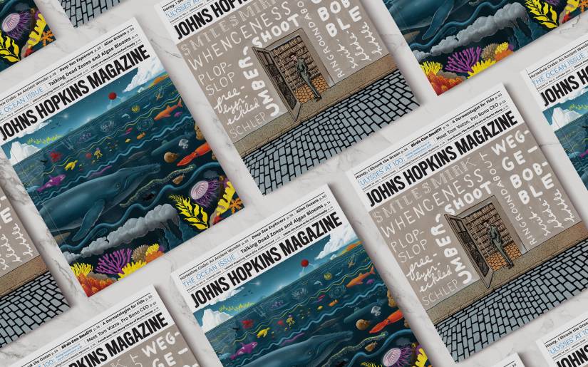
Above is a large image set to align center. All center aligned images create a full break between any content before or after them; text will not wrap around them. Image captions will display and are populated by the “caption” option on the image within the media gallery.
This is a collection of buttons typically used as calls-to-action.
Section breaks can be small or full width and come in a variety of brand colors. Below is a table. Table styles are fairly locked in and we do not offer ability to customize cell color or text color.
H6 is frequently used as a combination of section break and headline especially in tighter areas like within sidebars or narrow columns in footers.
I really do hope that someone gives an example of a pull quote so that I know what they’ll look like.
You (likely)
| Category | Information |
|---|---|
| Common Name | Tiger aloe, partridge-breasted aloe, partridge breast aloe |
| Botanical Name | Gonialoe variegata (formerly Aloe variegata) |
| Family | Asphodelaceae |
| Plant Type | Succulent, perennial |
| Mature Size | 18—24 in. tall, 8–12 in. wide |
| Sun Exposure | Full sun to partial shade |
| Soil Type | Well drained, sandy loam; cactus/succulent potting mix |
| Soil pH | Slightly acidic (5.5—6.5) |
| Bloom Time | July to September |
| Flower Color | Orange, salmon, pink, yellow (rare) |
| Hardiness Zones | 9–11 (USDA) |
| Native Areas | Southern Africa and Namibia |
Below is a thumbnail image set to align center. This treatment has been used successfully as a sort of stylized section break as shown here. All center aligned images create a full break between any content before or after them; text will not wrap around them. Image captions will display and are populated by the “caption” option on the image within the media gallery.
Displayed image size depends on the combination of size choice, alignment, and page template. Following is a collection of all possible options for this page template. Images will spread to 100% width when space is limited by the available width of the browser and/or the available width within each page template.

The largest display size we currently have. Typically we use large images in a centered alignment (shown immediately below) because of the limited space left for text to wrap around the image when set to left/right alignment.
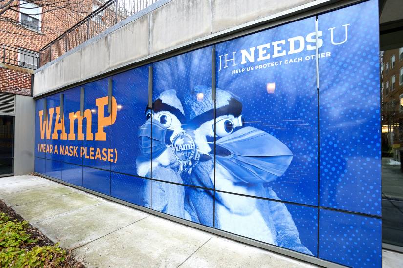
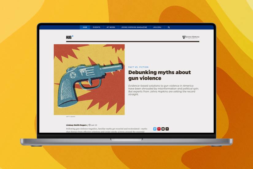
This image is size large, align left. It leaves room for text to wrap around it only at the largest screen sizes. This is not a typical treatment though it does work well on full width (no left nav, no right sidebar) pages.
Lorem ipsum dolor sit amet, consectetur adipiscing elit. Phasellus pretium, enim id semper scelerisque, magna felis ullamcorper purus, vel dignissim ipsum elit sit amet turpis. Sed faucibus lacus lorem, sit amet laoreet sem elementum vitae. Sed quis nulla commodo, commodo ante ac, vulputate tellus. Nulla in porttitor odio. Nulla pulvinar posuere justo eu semper. Fusce vehicula est a ipsum mattis porta. Cras at magna vulputate, ullamcorper odio in, semper mauris. Integer dapibus nisi quis lorem lacinia elementum. Integer et nulla quis arcu elementum pellentesque vel non libero. Donec sollicitudin felis eget arcu tristique ornare.

This image is size large, align right. It leaves room for text to wrap around it only at the largest screen sizes. This is not a typical treatment though it does work well on full width (no left nav, no right sidebar) pages.
Lorem ipsum dolor sit amet, consectetur adipiscing elit. Phasellus pretium, enim id semper scelerisque, magna felis ullamcorper purus, vel dignissim ipsum elit sit amet turpis. Sed faucibus lacus lorem, sit amet laoreet sem elementum vitae. Sed quis nulla commodo, commodo ante ac, vulputate tellus. Nulla in porttitor odio. Nulla pulvinar posuere justo eu semper. Fusce vehicula est a ipsum mattis porta. Cras at magna vulputate, ullamcorper odio in, semper mauris. Integer dapibus nisi quis lorem lacinia elementum. Integer et nulla quis arcu elementum pellentesque vel non libero. Donec sollicitudin felis eget arcu tristique ornare.
Integer elementum nulla quis vulputate consequat. Pellentesque feugiat odio diam, vel pellentesque nibh tristique non. Lorem ipsum dolor sit amet, consectetur adipiscing elit. Donec enim libero, placerat at dui et, pretium lobortis metus. Aenean vel condimentum orci, sit amet placerat erat. In non ex at erat eleifend placerat eu in lectus. Maecenas viverra turpis ut nunc semper, non suscipit ante ultrices. Aenean ac lacinia ex. Nullam euismod purus nec neque pharetra blandit. Nam dui eros, pretium ac mollis nec, pellentesque vel odio. Aliquam accumsan nisi augue, et varius lorem molestie at. Maecenas vitae eros nec purus blandit tincidunt et sed dui.
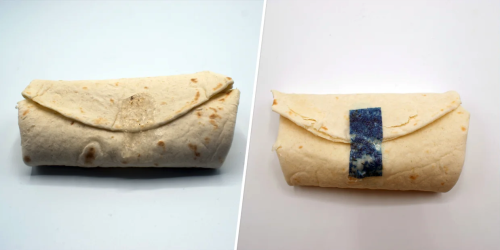
This image is size medium, align left. It leaves plenty of room for text to wrap around it. This is the most used size/placement treatment across our sites.
Lorem ipsum dolor sit amet, consectetur adipiscing elit. Phasellus pretium, enim id semper scelerisque, magna felis ullamcorper purus, vel dignissim ipsum elit sit amet turpis. Sed faucibus lacus lorem, sit amet laoreet sem elementum vitae. Sed quis nulla commodo, commodo ante ac, vulputate tellus. Nulla in porttitor odio. Nulla pulvinar posuere justo eu semper. Fusce vehicula est a ipsum mattis porta. Cras at magna vulputate, ullamcorper odio in, semper mauris. Integer dapibus nisi quis lorem lacinia elementum. Integer et nulla quis arcu elementum pellentesque vel non libero. Donec sollicitudin felis eget arcu tristique ornare.
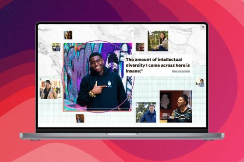
This image is size medium, align right. It leaves plenty of room for text to wrap around it.
Integer elementum nulla quis vulputate consequat. Pellentesque feugiat odio diam, vel pellentesque nibh tristique non. Lorem ipsum dolor sit amet, consectetur adipiscing elit. Donec enim libero, placerat at dui et, pretium lobortis metus. Aenean vel condimentum orci, sit amet placerat erat. In non ex at erat eleifend placerat eu in lectus. Maecenas viverra turpis ut nunc semper, non suscipit ante ultrices. Aenean ac lacinia ex. Nullam euismod purus nec neque pharetra blandit. Nam dui eros, pretium ac mollis nec, pellentesque vel odio. Aliquam accumsan nisi augue, et varius lorem molestie at. Maecenas vitae eros nec purus blandit tincidunt et sed dui.

The above image is size medium, align center. As with all centered images it creates a full break between the content before and after it.
Thumbnail images are the smallest size available for our sites. Typically used for added detail or smaller graphics. The first image on this page shows a thumbnail image aligned center, acting as a stylized section break.
This image is size thumbnail, align left. It leaves the most room for text to wrap around it.
Lorem ipsum dolor sit amet, consectetur adipiscing elit. Phasellus pretium, enim id semper scelerisque, magna felis ullamcorper purus, vel dignissim ipsum elit sit amet turpis. Sed faucibus lacus lorem, sit amet laoreet sem elementum vitae. Sed quis nulla commodo, commodo ante ac, vulputate tellus. Nulla in porttitor odio. Nulla pulvinar posuere justo eu semper. Fusce vehicula est a ipsum mattis porta. Cras at magna vulputate, ullamcorper odio in, semper mauris. Integer dapibus nisi quis lorem lacinia elementum. Integer et nulla quis arcu elementum pellentesque vel non libero. Donec sollicitudin felis eget arcu tristique ornare.
This image is size thumbnail, align right. It leaves the most room for text to wrap around it.
Lorem ipsum dolor sit amet, consectetur adipiscing elit. Phasellus pretium, enim id semper scelerisque, magna felis ullamcorper purus, vel dignissim ipsum elit sit amet turpis. Sed faucibus lacus lorem, sit amet laoreet sem elementum vitae. Sed quis nulla commodo, commodo ante ac, vulputate tellus. Nulla in porttitor odio. Nulla pulvinar posuere justo eu semper. Fusce vehicula est a ipsum mattis porta. Cras at magna vulputate, ullamcorper odio in, semper mauris. Integer dapibus nisi quis lorem lacinia elementum. Integer et nulla quis arcu elementum pellentesque vel non libero. Donec sollicitudin felis eget arcu tristique ornare.